Friday, April 23, 2010
Cartographic Animation
Animation of the different empires that historically conquered the Middle East.
http://www.mapsofwar.com/ind/imperial-history.html
Bivariate Choropleth Map
 This map shows the 2008 democratic primary results. The two variable represented are Clinton in green and Obama in purple.
http://politicalmaps.org/texas-primary-and-caucus-maps-clinton-and-mccain-win-texas-primary-obama-leads-in-caucus/
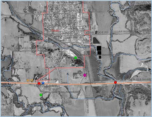
DOQQ
 The picture above is a black and white DOQQ. A DOQQ is an aerial photograph that has been orthorectified to prevent distortion. A DOQQ is an accurate representation of the Earth's surface. Photo was taken near Lago Vista, Texas.
http://www.crwr.utexas.edu/gis/gishydro00/Class/trmproj/Donnelly/termproject.htm
Cave Painting Map Catal Hyuk 6200 bc

Recreation of a cave painting that appears to be a map of a town perhaps near a volcano.
http://faculty.weber.edu/klpayne/History4210/default.htm
T-O Map
 An Early world map that was produced during the middle ages. It depicts three continents with a christian symbol of a cross and Jerusalem as its center.
www.loc.gov/exhibits/
Burmese Buddhist Map

Map shows continents and oceans as a series of circles. Map depicts Buddhist ideals rather than physical landscapes. This map is also known as the wheel of life.
www.loc.gov/exhibits/
Portolan Chart
 This portolan chart was drawn in 1559 on vellum. It depicts the Mediterranean area.
www.loc.gov/exhibits/
Ptolemic Geocentric Map
 Map depicting the Earth as the center of the Universe.
www.biocrawler.com/.../
Babylonian Clay Tablet Map
 Ancient Babylonian map produced on a clay tablet. Dated to about 2300 bc. Babylon is pictured as the center of the world.
 www.bible-history.com/
LIDAR
 LIDAR image of terrain taken by a conservation group. LIDAR stands for light detection and ranging. LIDAR creates more accurate imagery of landscapes than aerial photographs.
www.treehugger.com/.../
Nominal Area Choropleth Map

A simple political map of West Africa.
http://mapmaker.rutgers.edu/355/links.html
Proportional Circle map
 Map displays population size using increasingly larger orange circles. The larger the population the larger the circle representing it.
http://mapmaker.rutgers.edu/355/links.html
Bilateral graph
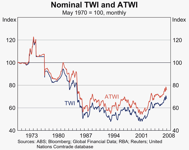 Bilateral graph displays monetary data of Australia for the years 1973 through 2008. ATWI in red and TWI in blue are the two weights displayed.
www.rba.gov.au/.../
Lorenz Curve
 Lorenz curve graph displaying percentage of households v. percentage of income. The red line represents the lorenz curve and the green line represents perfect equality.
www.biocrawler.com/.../
Index Value Plot
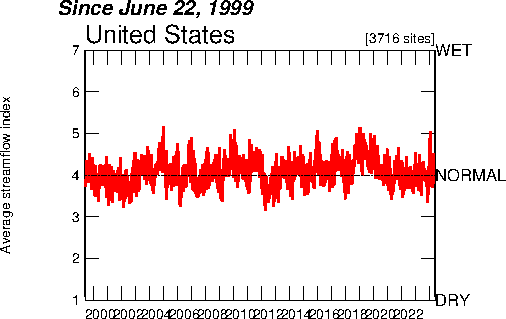 A plot of the average historical stream flow in the United States. Ranges from 1999 to 2009.
http://waterwatch.usgs.gov/?m=real&w=plot
Scatter Plot
 This plot shows the results of a study of the relationship between phosphorous and nitrogen in water runoff. The study took place in Ireland in 2003.
http://www.teagasc.ie/research/reports/environment/5022a/eopr-5022a.asp
Population Profile
 Population profile shows the projected effects of the AIDS virus on the population of Botswana. The gray color shows what the profile should look like while the pink shows how AIDS alters the population profile.
www.fao.org/docrep/
Climograph
 The climograph depicts precipitation and temperature data Memphis, Tennessee.
www.uwsp.edu/.../glossary/
Windrose

A windrose depicts wind direction and wind speed. A windrose most often displays 16 or 36 directions.
http://www.maine.gov/dep/air/meteorology/Windrosehome.html
Triangular Plot
 The triangular plot serves to represent 3 distinct soil texture variables.
http://www.improving-visualisation.org/vis/id=241
Parallel Coordinate Graph
 This graph shows the spacial pattern of nine genes within a cell.
 http://vis.lbl.gov/Events/SC07/Drosophila/
Histogram
 This histogram displays data for the total voltage of harmonic distortion for one year.
http://www.pqview.com/pqview-charts/value-logs/1386619
Box Plot
 Box plot displays various information including maximum value, minimum value, 75th, 50th and 25th percentiles and mean.
 http://www.synapticscience.com/seurat/visualization/
Stem and Leaf Plot

A stem and leaf plot for the infant mortality rate of countries in western Africa.
http://mainland.cctt.org/mathsummer/JosephBond/StemAndPlots/stem-and-leaf_std.htm
Similarity Matrix
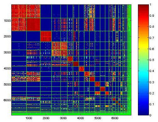
This similarity matrix shows the similarity of the behavior of live internet malware infections. Red pixels represent similar behavior patterns while blue represents unrelated behavior patterns.
http://cgi.mtc.sri.com/Cluster-Lab/
Correlation Matrix
 This correlation matrix represents the findings on a study done on livestock genes. It represents the top 100 cancer genes. The letters represent where the gene was found:A = extracellular matrix; B = nucleus; C = actin cytoskeleton; D = fatty acid metabolism and E = glutamine.
http://www.livestockgenomics.csiro.au/Genome_to_Phenome/
Star Plot
http://www.math.yorku.ca/SCS/sugi/sugi16-paper.html
Classed Choropleth Map
 This classed choropleth map shows the frequency of occurrence of low birth weights in Connecticut. The towns are colored in shades of blue to represent the percentage of low birth rate. The darker the blue color the higher the frequency of low birth weights.
 http://www.ij-healthgeographics.com/content/8/1/52
Thursday, April 22, 2010
DEM

A Digital Elevation Map of Finger Lakes Trail in New York.
http://ludlow.dns2go.com/cribbage/flt/flt.html
DLG

USGS Digital Line Graph map. It was made using a scale of 1:100,000.
http://ga.water.usgs.gov/olympics/sav.sm.dlg.html
DRG

This is a Digital Raster Graphic image. Its a USGS topographic map of Washington DC.
http://egsc.usgs.gov/isb/pubs/factsheets/fs08801.html
Isopleth

Isopleth maps show rain pH. The lines connect areas with the same pH. This Map shows Rain pH across the US. The green and orange colors are used to represent basic or acid rain.
http://dwb4.unl.edu/Chem/CHEM869V/CHEM869VLinks/weather.about.com/newsissues/weather/library/weekly/aa071600a.htm
Isopach

This is an Isopach map of the moon. The purpose of an Isopach map is to show the thickness of the rock or strata. Isopach lines connect areas of equivalent thickness.
http://www.fas.org/irp/imint/docs/rst/Sect19/Sect19_6.html
Isohyets

This map shows information about the rainfall levels in Africa. Isohyets are lines on a map that connect areas with equal amounts of rainfall.
http://artsci.wustl.edu/~anthro/courses/306/geography.html
Isotachs

The dark lines represent geopotential height. The red lines are the isotachs and the blue symbols are rain barbs. Isotach lines represent areas of the same wind speed.
http://www.erh.noaa.gov/btv/events/28Oct2008/ua2.php
Isobars
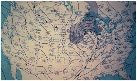
Isobar map showing areas of high and low atmospheric pressure over the United States. The isobars indicate a cold front in the southern part of the US. Isobars indicate areas of equal atmospheric pressure.
http://www.scienceclarified.com/Vi-Z/Weather-Forecasting.html
Black and White Aerial Photograph
 Black and white aerial photo of Pottowatomie with overlay. Overlay depicts streams in blue, city outline in pink and a highway in orange.
 http://www.kgs.ku.edu/CMI/how_to_use.html
Infrared Aerial Photo
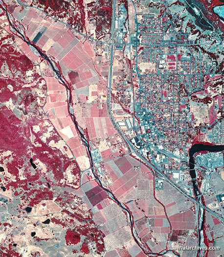
An infrared photo of Somona County, California. Somona county is known for its wine production.
http://www.aerialarchives.com/Aerial-Maps-of-Sonoma-County.htm

Cartogram
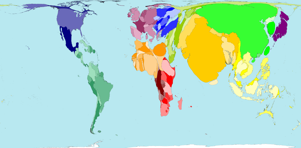 In a cartogram map a variable is substituted for land area. This distorts the true shape of the land mass. In this case human population is the variable. This map clearly shows that most of the worlds human population resides in developing countries.
 http://www.worldmapper.org/display.php?selected=2#

Isoline Map
 The temperature in Australia for the month of January is show in this map. The lines of equal value depict the temperature in degrees Fahrenheit over the continent.
http://mapmaker.rutgers.edu/355/links.html
Choropleth Map
 This choropleth map shows the percentage of Hispanic/Latino residents in Florida by county. The counties a coloured in various shades of green to indicate the percentage. Natural breaks in the data were used. This map is based on census data from 2000.
http://my.ilstu.edu/~jrcarter/Geo204/Choro/Tom/
Dot Distribution Map
 The dots represents participants from the United States and Canada of the Feeder Watcher Program. The Feeder Watcher program was conducted by the Labortoire D'ornithologie de Cornell in 2000-2001. Participants in this program counted birds that visited their bird feeders during this time.
http://www.birds.cornell.edu/pfw_fr/Members/ParticipantMap00.htm

Planimetric Map
 This planimetric map was created for usage by Potlatch real estate company. It shows a plot of land in Big School, Idaho. The dark blue outline on the map shows where plot #11 is located.
 http://realestate.potlatchcorp.com/idlands/REparcel23.asp
Hypsometric Map
 In this map the elevation in France is depicted by gradual shading of contour lines. In this map the lighter colours indicate a higher elevation.
 http://www.reliefshading.com/colors/hypsometric.html
PLSS Map
 This map shows all townships in Alabama, The Franklin county townships are indicated by the blue colouring.
 http://www.rootsweb.ancestry.com/~alfrankl/land.html
Tuesday, April 20, 2010
Cadastral Map
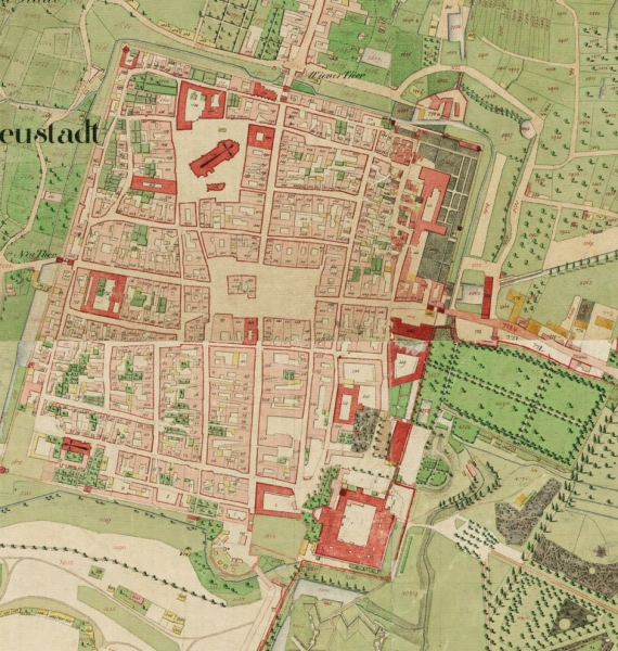 This cadastral survey was completed in Austria under Emperor Franz I. It is now held in an archive in Vienna.
http://www.fig.net/hsm/news/frans_1_2007.htm
Thematic Map
 The amount of methane emissions caused by growing rice is shown in this thematic map. The colours of the countries correspond to the map key located at the bottom.
http://www.epa.gov/appcdwww/apb/gloed/map.htm
Topographic Map
 This map depicts the Asama volcano in Japan. The map was made as a part of an aeromagnetic anomalies study over the volcano in 1992. The contour lines of this topographic map have been shaded various colours to better depict elevation. The pink lines indicate lines of flight conducted during this study.
 http://unit.aist.go.jp/igg/geophysmap-rg/amag/asama_fig_E.html
Subscribe to:
Comments (Atom)